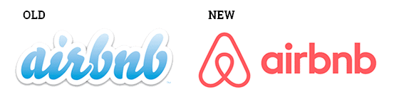
Top ten reasons for rebranding
Sooner or later, the time will come when your corporate identity is no longer relevant. Recognizing when this is the case may seem difficult, but there are several moments in the life of an organization that lend themselves to, or even require, a change.
On average, organizations and brands change their corporate identities every seven to ten years. This often involves redesigning logos, color palettes, imagery, and photographic style. In a small number of cases, the organization’s name is also changed as part of this process. Although there is usually one main reason for a change, the motivation behind a rebranding project is often a combination of several factors. Here is an overview of the ten most common reasons for corporate rebranding:
Why Rebrand A Company?
Large companies such as Coca-Cola, Shell and PepsiCo have long dominated global markets. The Internet, however, has made it possible for small and medium-sized businesses to reach international customers. When venturing into new, global markets, it is critical to rethink your brand or product names.
Product names need to make sense to overseas customers, and you should not rely on computer translations. Instead, consult with a local to help you communicate effectively. For example, Lay’s uses different brand names in different markets, including Walkers in the United Kingdom and Smith’s in Australia.
LG Electronics is another company that has changed its name to conquer overseas markets. The Korean brand was formerly known as Luck and GoldStar. It began using the name LG in 1995 to appeal to Western customers. When using a new logo, make sure it is not offensive or culturally sensitive.
Examples of rebranding failures
Radio Shack rebrand failure

With the halcyon days of gathering around the family radio long gone, Radio Shack is no longer a name that conjures up images of cutting-edge technology. When Lee Applbaum took over as Radio Shack’s chief marketing officer in 2008, he sought to distance the brand from its more antiquated roots by rebranding as “The Shack.
Despite a new focus on wireless technologies in its retail stores to accompany the new name (and a small increase in profits immediately following the rebrand), Radio Shack continued to decline, and “The Shack” was abandoned.
Radio Shack had established itself as a resource for do-it-yourself electronics enthusiasts, and that consumer niche had kept them afloat for years. When they rebranded as “The Shack,” they turned their backs on those DIY hobbyists to pursue the modern, tech-savvy consumer. But the broader tech competition proved to be too stiff, and Radio Shack filed for bankruptcy in 2015.
How to avoid this: Choose a new business name, logo and corporate identity that won’t alienate your most profitable audience. And if you’re going fishing for a new audience, make sure it’s a fish you can catch.
Tropicana rebrand failure
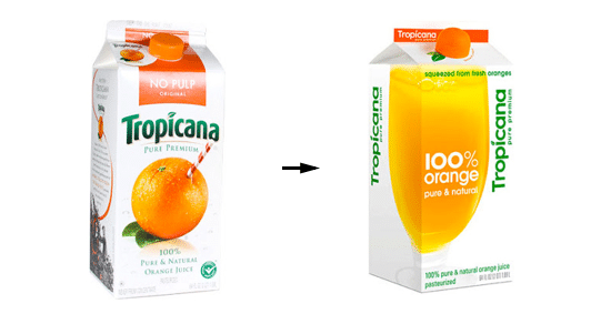
The original Tropicana logo featured a unique, signature design – an orange pierced by a straw. The logo implied that Tropicana juice was fresh, undiluted and straight from the orange.
The uniqueness and playfulness of the orange and straw visual created a powerful brand image. It was instantly recognizable on the shelf and had had years to build a relationship of trust with Tropicana’s consumers.
The new Tropicana package image featured a large glass of orange juice, which unfortunately read as a flat, orange gradient. The traditional Tropicana typeface was replaced with a sleeker, modern typeface, and every last bit of recognizable character was lost.
It’s possible that some consumers couldn’t even find Tropicana on store shelves because the packaging was so different. Those who did find the repackaged Tropicana expressed strong disapproval. Information Resource, Inc. reported that Tropicana’s sales dropped 20% immediately after the brand relaunch.
How to avoid it: Aim for a signature look that says something about who your company is. If you already have one, abandoning your signature look for a nondescript design is a step in the wrong direction. Keep what works for you and discard what doesn’t.
PricewaterhouseCoopers rebrand failure
![]()
PricewaterhouseCoopers took the rebranding plunge in 2002 when it decided to sell off the consulting arm of its business. Bizarrely, they chose to name their new consulting offshoot after a day of the week: Monday. The strangely vague and unrelated new name was immediately ridiculed and abandoned within a year.
The first lesson is common sense – a business name that has nothing to do with your business tells your audience nothing about your business; and, consequently, nothing about why they should care.
Keeping the same business name and domain name ensures that consumers can find you after you’ve unveiled your new brand identity. It probably goes without saying that it’s not a good idea to both change your website’s domain name and choose a new name that’s so ubiquitous that your business will never be found in a Google search again.
“Monday” was not specifically related to PwC’s financial consulting business, nor was it unique enough to be a useful search engine term. Potential clients would be forced to wade through pages and pages of “Monday” results before finally finding the Monday they were looking for. They would most likely give up long before that.
How to avoid this: Uniqueness and specificity are key. Choose a business name that allows your audience to find you in the online crowd. And if changing your name is part of your rebranding plans, choose a name that reflects who you are and what you do.
Hershey’s rebrand failure
![]()
Hershey’s original logo featured a three-dimensional design of the company’s name and a delicate, silver-wrapped Hershey’s Kiss on the far right. While the new logo uses a flat, modern style and font, it is still reminiscent of the previous, well-known logo. However, the redesigned Kiss strongly resembles a brown, stylized steaming pile of poop. This did not go unnoticed.